
The Bauhaus movement was founded during 1919 by Walter Gropius and started a domino effect of work that combined creativity and manufacturing. The school itself produced many students and teachers who’s work is influential to this day, artists like Franz singer and Friedl Dicker created the interior designs that remain a traditional part of Bauhaus design, while work done by Annie Albers introduced the idea of weaving, pattern and colour, and more surrealist work was pursued by Kandinsky. For my Bauhaus project I aim to go down the path of colour and pattern for the majority, however perhaps looking at the costume parties like the 1922 Triadic Ballet which featured outfits which embody the meaning and love that the Bauhaus artists held. I have chosen the pattern and colour path since it has influenced the modern fashion world even to this day, the schools progression of repeat pattern using shape and primary colour is seen everyday in the world around us.
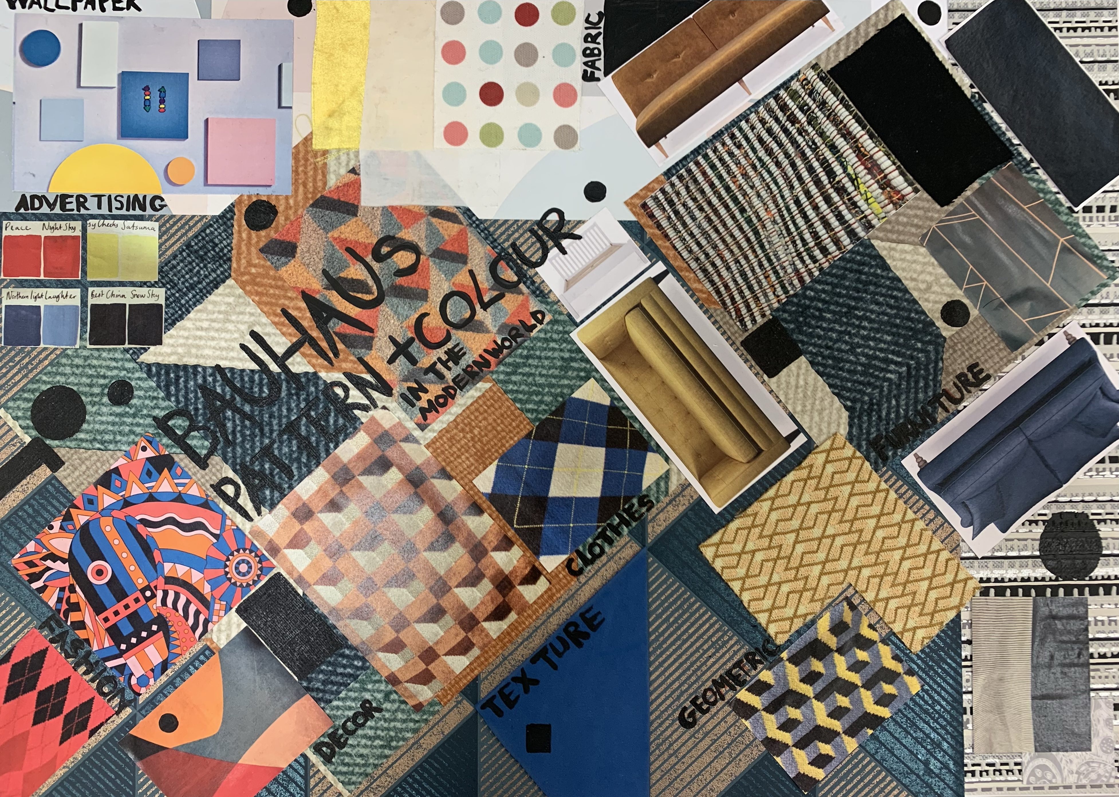
My first idea for some primary resources was a simple walk through Exeter town, everything on this board is either photographs I took of materials or physical materials I took from shops. For the background I found some geometrically styled wallpapers, there is furniture I cut out from furniture booklets I found in John Lewis, business cards with Bauhaus – like designs on them and many photos of jumpers and cushions which I found in places like Marks and Spencer’s, even some fabric samples for curtains. This expedition was very helpful to me because it showed that when you look for work that features the colours, patterns or structures of Bauhaus it really is all around us. It was also helpful to see how not all the influence included the traditional primary colours which I wasn’t particularly looking forward to using, I much prefer the secondary colour route, perhaps purples, greens and oranges, a strange colour combination, however one I think could work. It has also broadened the amount of produce that the colours can be used for – pretty much anything!
Route One
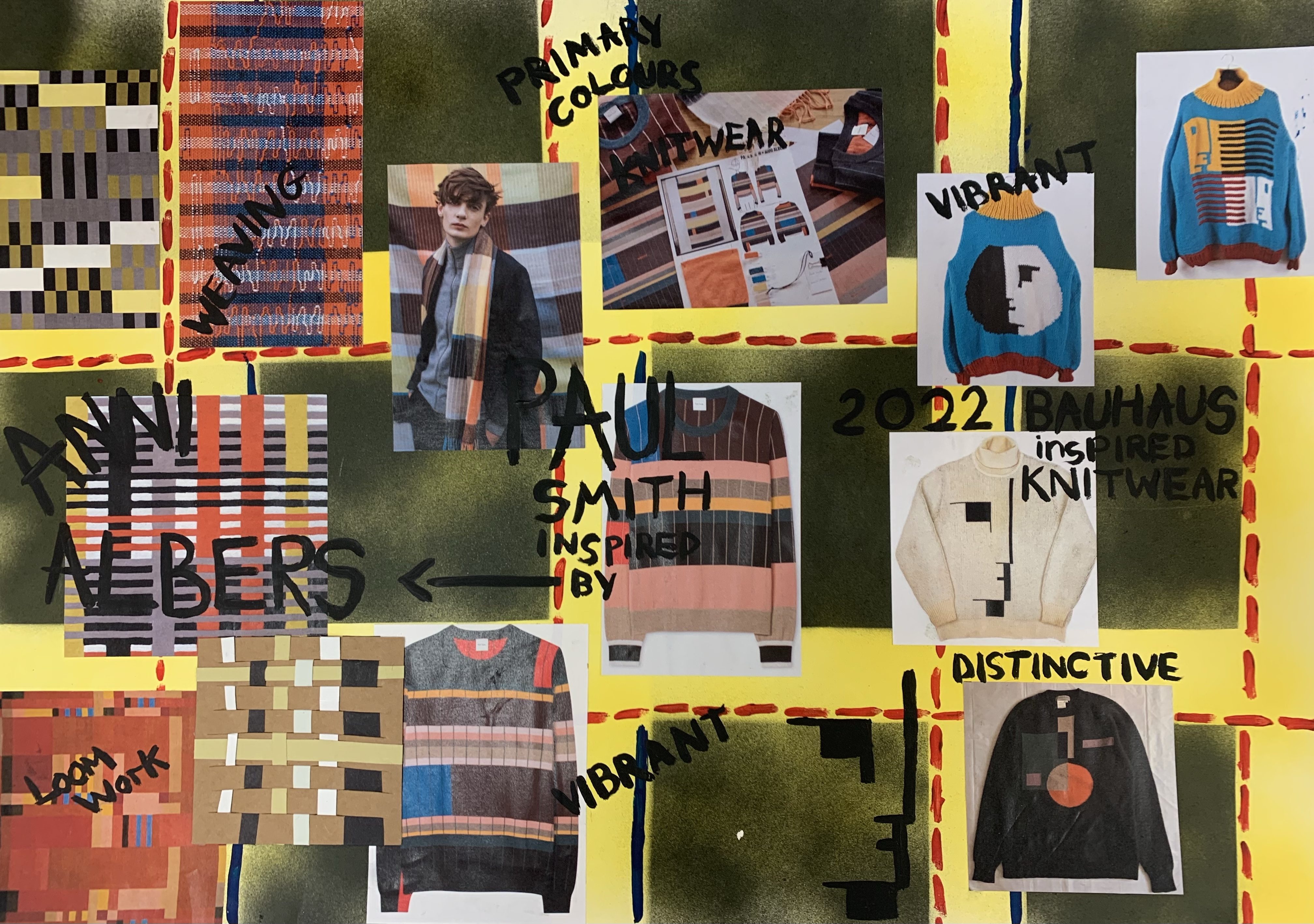

For my first route I wanted to pursue the idea of weaving and knitwear and how colour was used within it, to begin I looked at the infamous Anni Albers who was the artist within Bauhaus who created these woven pieces and designs for weaving, as can be seen a lot of her colour pallet worked with slightly duller colours than is traditional for Bauhaus, however there is of course the classic input of yellows, reds, blues, black and white. Anni’s work, while changing the weaving produce forever, also directly influenced Paul Smith to create a series of knitwear based on Anni’s weaving designs, his series featured jumpers and scarves mainly with the colour pallet of brown and pink, with a small influence of Yellow, red and blue for a link to the Bauhaus original colourings. The Bauhaus designs can still be seen in the 2022 market as well, with knitted jumpers featuring the Bauhaus symbols, and the classic Bauhaus shapes. This inspired me to try out creating some weaving designs and possibly some knitwear as well.

The first piece of experimentation I tried was featuring the traditional weaving method inspired by Anni Albers with simple black and white pieces of card, the only way I tried to change the style of the weaving was by using zig zags and wavy lines to create a more unique effect, I really liked the result and created a Bauhaus – like design using bold shape, figure and the pattern for the dress was a piece of waving cut up and reused. I then tried to take the weaving idea a step further by using black material and weaving it to create a base, I then tried to work into it with white, and then some secondary colours that I had previously thought of integrating: orange, purple and green. I didn’t like the outcome of the material weaving sample, it seemed messy, I think the material I used for the black base was too chunky and I subsequently lost all clarity in the weaving.

I next decided to create another of the weaving pieces with paper and cardboard, this time trying a more traditional approach, but with four colours so that it was more relatable to the pieces Anni Albers created, I tried to use the colours in the weaving to create another design using the harsh Bauhaus shape and I had a play around with the texture, incorporating some fabric on it that I used for the previous material weaving piece, I really like this design, its simple while still having the clear aspects of Bauhaus influence. I then decided instead of creating another weaving piece I would use some inspiration from Paul Smith and knit a sample instead, I tried to find some yarn as similar to the colourings in the weaving that I could, and the multicolour yarn creates a lattice like effect that almost seems like weaving itself. The knitting inspired lots of different ways I could create a blocky Bauhaus shaped dress, and since I used a thicker yarn it definitely creates the blocky look better than a thinner yarn would.

To further experiment with the weaving idea before moving onto knitting I digitally created a lattice pattern with the weaving pieces I created, I think it could be a good design for a fabric that represents the Bauhaus’s love for shape and a good response to Anni Albers. I then changed the hue of the brown weaving piece to add the colourings of the Bauhaus and it really shows how a Bauhaus pattern can easily be made from shape and colour. I really like this result, its intricate and effective, and I could easily make the pattern smaller, bigger, differently coloured and it would still have the Bauhaus look.

My next idea was to move onto some design ideas that I wanted to reflect my first final piece, I created a sketch that featured all of the main secondary colours that I had previously thought of using, based on a black background for maximum effect, the main concept idea was a blocky square like dress with blocky squares of Bauhaus colours. Before jumping straight to knitting I wanted to try out a few different forms of crochet and knitting to see which look fitted what I wanted. The looser crochet was a interesting finish however the gaps didn’t create the blocky effect I wanted, I then tried to freestyle a triangle in green – although it didnt work very well and I came away with a strange looking shape. I did like the density of the result and thought I could create an easy square for my result, however when I tried the blocky yarn on top of the blocky black I loved how it looked, although the sample is a bit messy I will refine my knitting for the final thing.

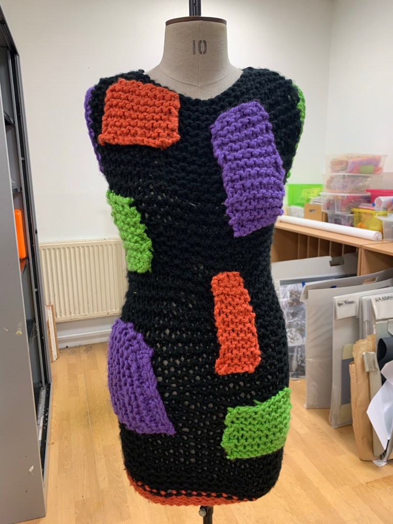

For the final outcome I went with a short black dress that roughly resembled the shape of a square, with 2 blocks of each of my chosen colours: orange, purple and green, along with the corresponding colours on the sleeves and bottom of the dress. With my result I hope to have brought a more modern response to the Bauhaus style, I think the piece clearly shows what I wanted to, the clear shape, colour and style. I am really pleased with how the thick yarn turned out as it makes the dress itself become a seperate more solid shape. The only things I would change would be the neatness of the squares I attached to the dress since the method was harder than I thought it would be.
Route Two


For route two for my Bauhaus project I decided to pursue the route of print, texture and colour, for this I took inspiration from original Bauhaus artists such as Josef Albers who studied colour theory and mixed it with Kandinsky’s wild creativity. I decided to experiment with shape through pieces of lino, squares of wood and pieces of foam, I used textures such as bubble wrap, fabric lace and even my own hands to show the texture of fingerprints and how the lines on hands could create this unique texture. The last additions to the piece was some green masking tape I used to divide the print into different squares and section off some of the areas, finally I screen printed a silver square in the middle that, while not too easily seen on camera, adds a sheen to the piece. I decided that for my original print I would use green as the comparing colour which adds a certain idea of gloom and creepiness behind the image, something I enjoy since it shows how certain colours mixing creates a certain emotion, I think its the broken raggedy black printing on top of the green that adds the darker aspect to the print, in my mind links to Frankenstein and the Gothic are made. Overall I was really pleased with the outcome of this piece, it reflects the creativity and fun that can be used to make pattern and print since I really did just put whatever wherever felt right.

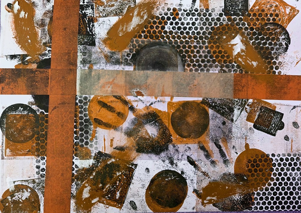
My next step was to look more into the colour theory aspect of my print work, I felt the green represents a dark gloomy piece so I was interested to see how my other two secondary colours influenced the feeling of the piece. For the purple I think a fun piece is made, it seems brighter and more colourful and light-hearted compared to the green, however the orange also gives darker connotations and it seems like an apocalyptic piece, the orange comes off rusty and dirty. I found this very interesting because the brightness and vibrancy of each piece stayed the same and the change in feeling came purely from the colour change, the most surprising for me was how the purple creates such a bright fun response wheras the other two do not.


For a little experiment I decided to create a pattern from the three different colour variations of my print, these two versions show the prints in different directions and sizes, I like the results as they show how easily the colours can complement and brighten each other into a fun pattern, one you may find on a children’s top or bedsheets. I dont think this pattern will move any further into my work since although I do like it the print pattern mixed with multiple bright colours makes it a bit too busy for my liking

This A2 sheet features a few more prints I have done on a slightly smaller scale, rather than the busy nature of the first print I did I used bubble wrap and one shape for the prints, although I really liked how busy the first piece was I thought it would be good to try something out thats more traditional For this print I only applied one layer of ink to each piece, which created the effect where the prints became fainter and fainter. I mixed these new prints with some printed photocopies of my first messier print, which shows a direct comparison and creates an element of pattern making. I like the page as a whole rather than the individual squares, the smaller vs larger complements each other and I could see this piece as a possible fabric pattern.
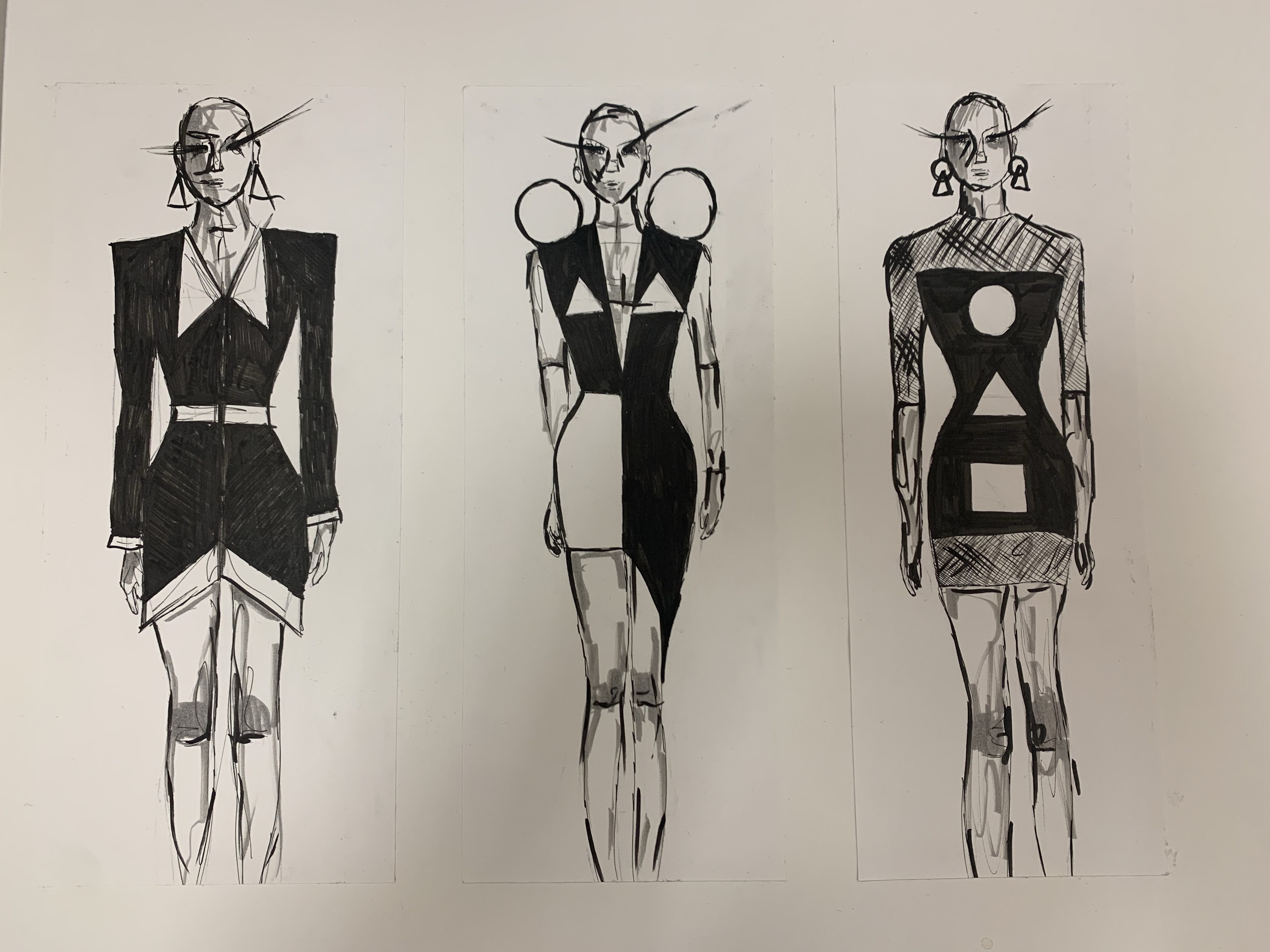
Next I decided to move onto the design process, my plan was to make some simple base designs that I could later layer my prints onto to see how the colour looked in the form of a Bauhaus fashion response. For the first design I decided to play with harsh lines and a more business style approach, thinking that I could incorporate some of the Bauhaus triangles into the shoulders, the next was a way to mix colour, class and still add the obvious Bauhaus triangles and circles, I particularly like the idea of the spheres on the shoulders, I’m not sure how I could create them but I’m sure with some wiring or paper Mache it would be possible. For the final design I have a simple black dress with the three main shapes down the middle, what I liked about this was the idea of the mesh underlayer that somehow also has the print onto it.

Once I had created my physical base designs I used photoshop and the original print I created and scanned in to see how the designs would work in a fashion sense, I immediately decided that the “squarer” left design didn’t look as good as I hoped it would, perhaps with a checked design or just squares it would look a lot nicer but it just looks harsh and messy. The second design however I think really works, I left the white areas empty and I think either white or black could work well against the design, maybe even black a bit better as it helps to bring out the black of the ink, I didn’t end up putting the squares in this version of the design as I thought it had too much going on with them and it made more sense without. I also really liked the mesh dress idea as the mesh adds a different element which would be good to experiment with.
After layering the prints onto the original designs my favourite is by far the end right ones, there’s something about the shape that effortlessly drops down into a triangle, incorporates shape and colour in a classy looking way.

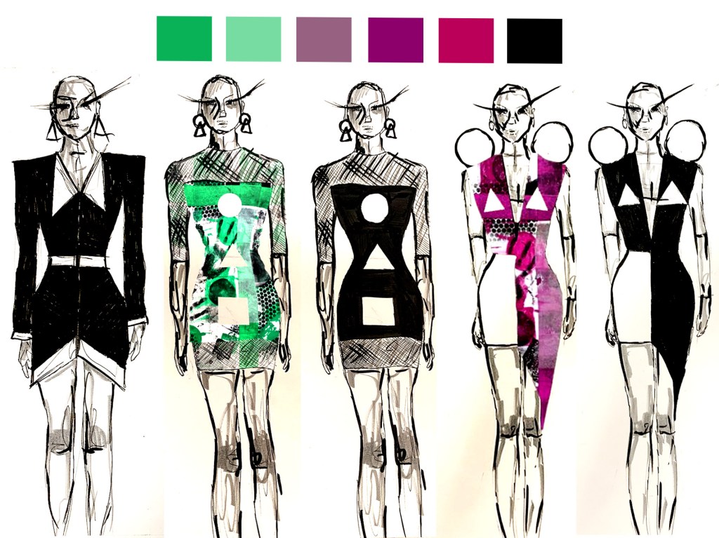
To see how the original primary Bauhaus colours impact these designs I changed each of the designs to one of the colours, surprisingly although I have previously thought the primary colours to bold and ugly I much prefer these colour choices to the outcome of the green! While I wont be using any of these colours in my final piece since I am still sticking with the secondary colours route, it does show that perhaps a brighter colour could be more eye catching and “Bauhaus-like”.

Since sustainability is very important to me I decided to experiment with a paper outcome for my second route, I thought this would be a fun way to see how paper can be manipulated to appear like fabric, and even create ideas that fabric cannot. Using some leftover photocopies I used some models from some magazines I had to hand and just went with the flow of the paper to see how shape could be portrayed into clothing shape, on the left there is a more traditional doll like dress that uses a lot of triangles to make the skirt, while the circling detailing stays to the sleeves. The middle design has a more abstract design just showing how harsh squares can be used to make a silhouette, the last design however is my favourite, it is just one A4 piece of paper that I folded into this triangular crafted design, I particularly love the idea of creating shape and clothing from just a sheet of paper.

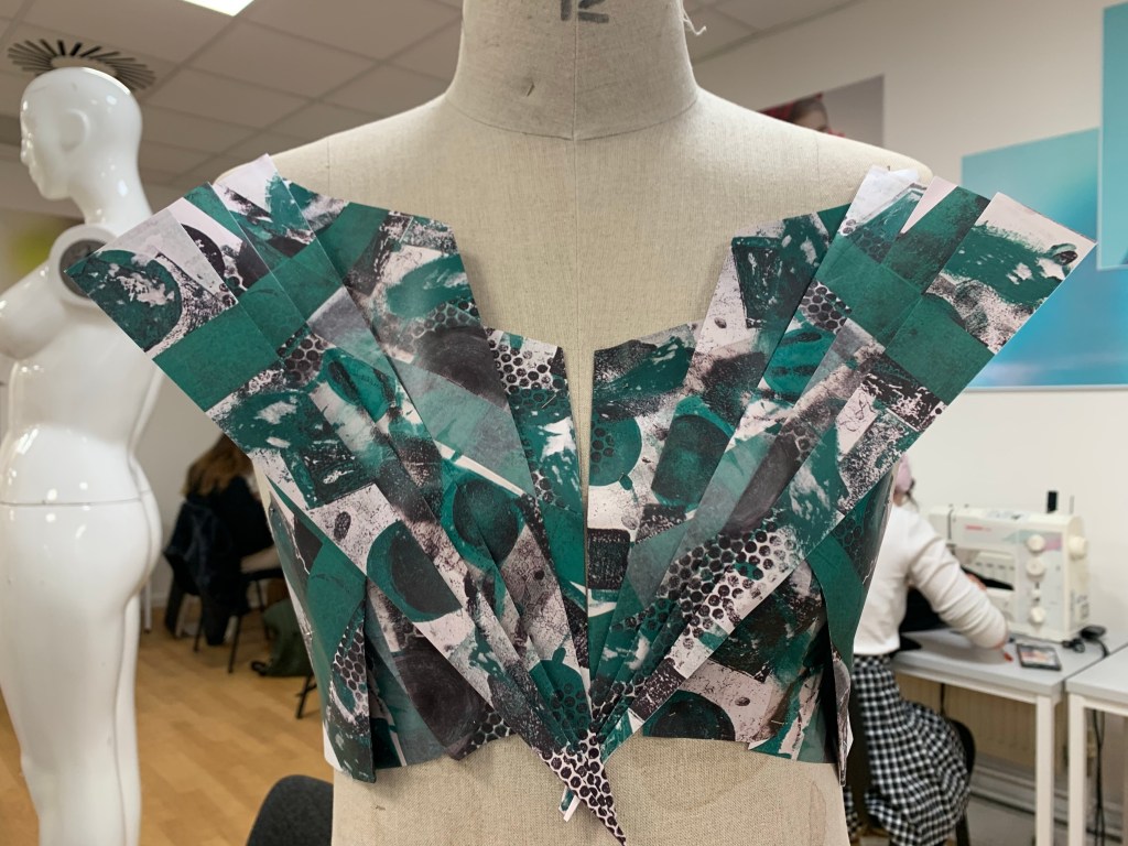
To make the vision of a paper dress come to life I printed out about 10 sheets of A4 paper, which really isnt that many! Each had a scaled down version of my original screen print, the first thing I did first was to make the chest area, which was by far my favourite part, using just a piece of paper on each side I was able to create a unique neckline and fitting chest section. This is the part of the dress where I was able to incorporate the triangle referencing, the circles come in as part of the skirt area of the dress which features layers and layers of loops and chaining, the result of which I really like, it reminds me of a year 6 prom dress someone may have had back in the day.
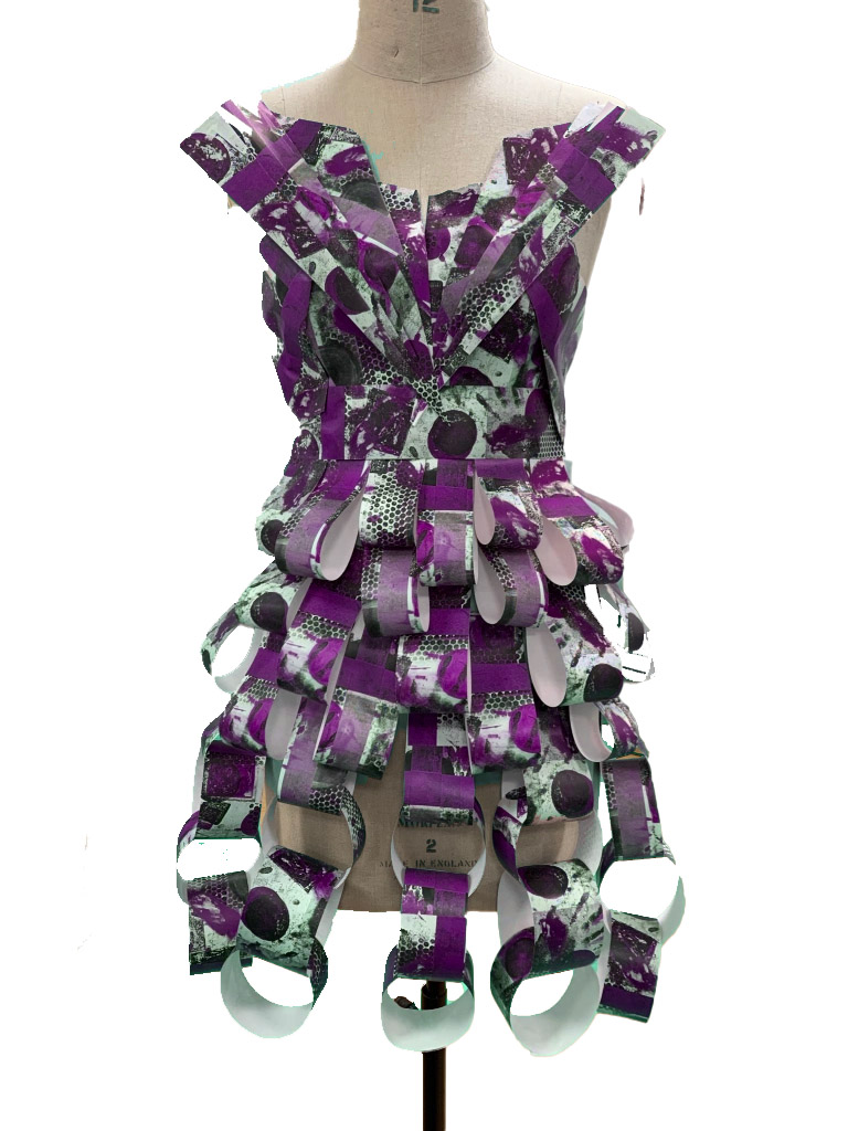
Just for a little added piece of experimentation I wanted to see how the final product would look if I changed the colour to purple since I had been a bit unsure about which colour I should make my final piece in, and unfortunately I really really like the result so I think I may remake my final piece for this section and perhaps make the middle digital design that I really liked but in purple instead of the green! I feel as though the purple adds a more fun feeling as the green is falling a bit flat for me after its been constructed, and on camera it loses even more of the brightness.

Route 3

For my third outcome I am going to take influence from the original Bauhaus architectural designs by Friedl Dicker and Franz Singer, while I was in Vienna there was an exhibition featuring many of the original designs on loan from the Bauhaus archives so I visited and learnt a lot of interesting background and was able to look in detail at the colours and techniques that were used to make the images associated with the Bauhaus movement to this day. Something I was quite surprised with was how most of their designs did not feature the glaring yellows, blues and reds that I had associated with their work previously, instead they favour a more pastel range of colours so I think for this result I will focus on pastel secondary colours instead of the bright earlier results.

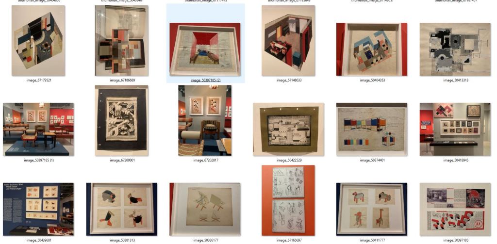
These are the main photos I took when I visited the Wein museum, I particularly like the designs which feature the 3D designs as they have multiple layers of design, I can imagine a 3D style dress perhaps with padding or stuffing in it to add those extra layers. I was also very interested by the more sketchy designs and may try a few little designs in pencil to get some ideas down quickly and have a different format for ideas.
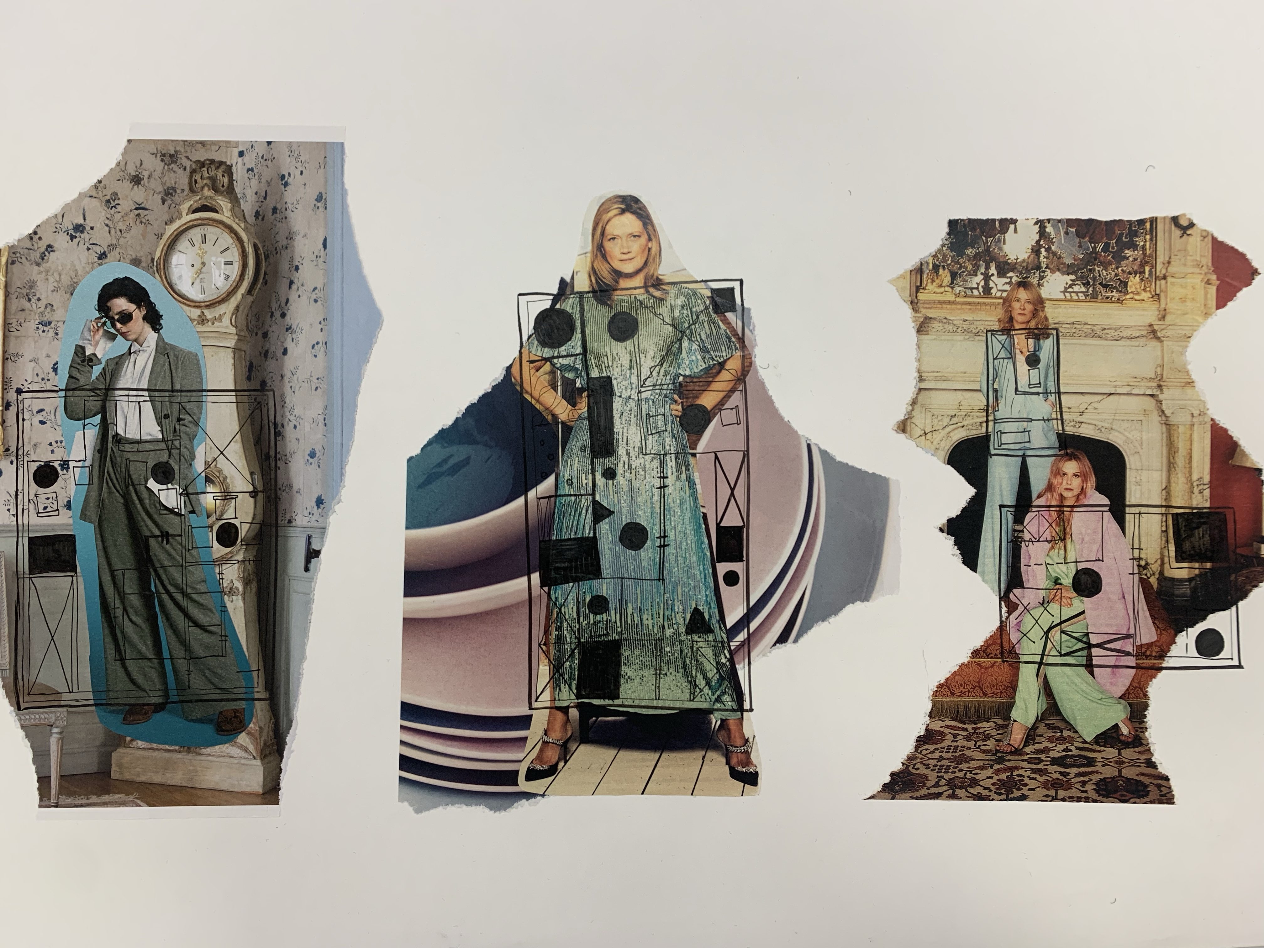
My first area of design was to collage some images I found in magazines to add three model options and then I drew some of the original singer and dicker like work on top of the collages. This was a way for me to see how the square designs could physically work and fit onto a body, this was really helpful to me because it gave me the idea of a wearable board idea, but with fabric of course, in a way liking to Vivienne Westwood’s protest boards. To make the 3D effect work I am thinking to add padding or stuffing into the fabric to make a sort of padded overlay onto an outfit, perhaps in a square or a cube so I can machine embroider or paint onto the fabric to make these designs link to the work I saw in Vienna.


Following my ideas for boards or an overlay I came up with a few designs as a response to Singer and Dickers work, the idea to have these designs padded and the details added on top, perhaps even with more padding. For the first piece I adapted the design for one of the halls they designed, I kept the 3D angles the same and I really love this result, I can imagine it in pastels with embroidery and I really like the idea, the same for the second design which is slightly shorter but still has all the elements that I love. For the third I just had a bit of fun experimenting with shape and ideas, I love the design itself, but it wont be one I use, lastly the fourth is just a mini one which I may use for a sample to get to grips with the idea itself.
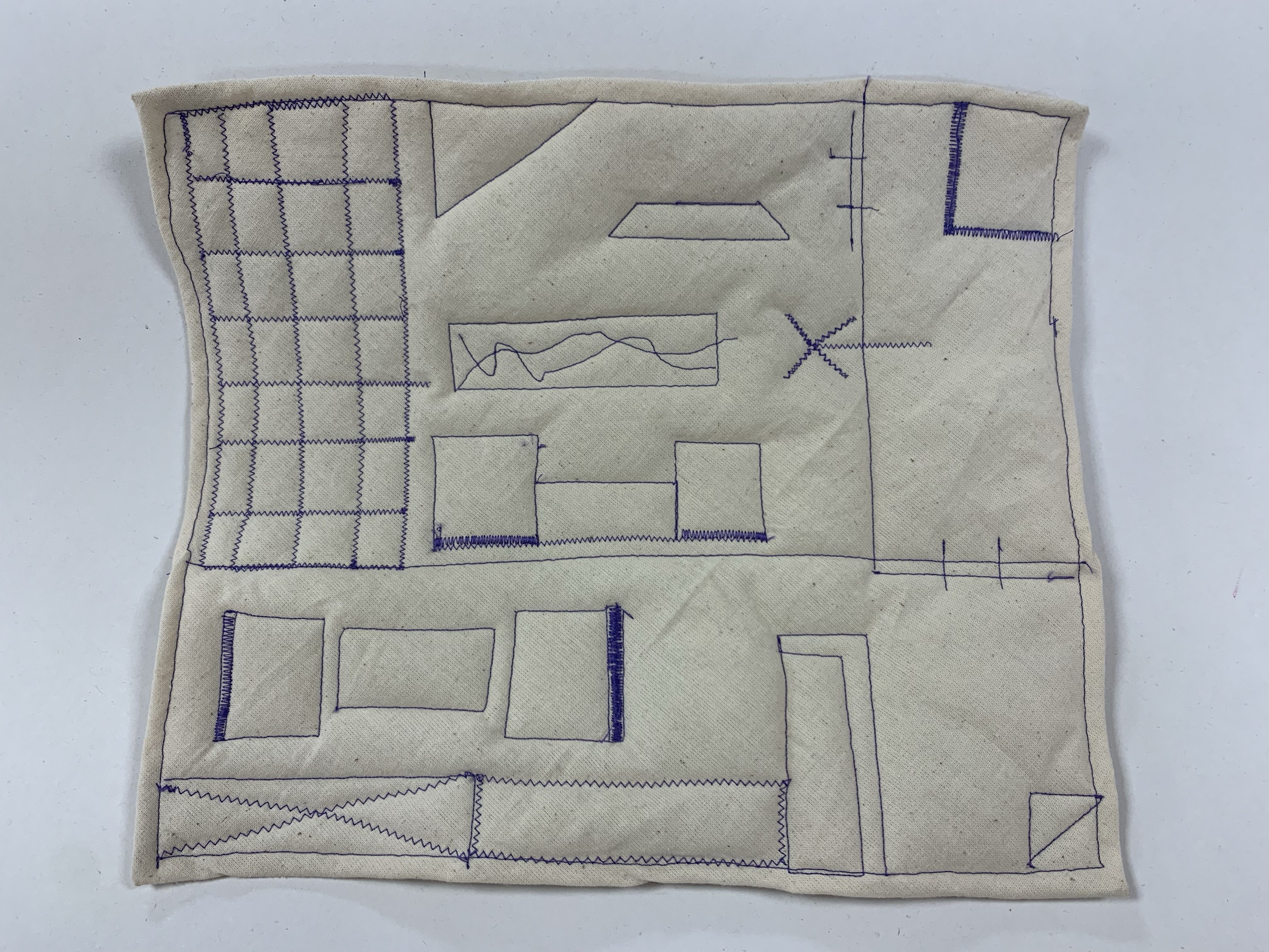
To follow on from my designs I decided to do a piece of quilted machine embroidery, I started by sewing a piece of canvas material onto a piece of batting to create the quilted base, I then put purple thread into the machine and embroidered one of the architectural designs inspired by Singer and Dicker onto the canvas. Although this was quite a quick and rough sample I really like the outcome, the only thing that needs to be worked on is neatness and making sure the batting is attached securely, however the neatness can be easily changed by sketching a design onto the fabric to follow.


I came up with the idea to make a waistcoat out of quilted orange material (and a black/navy lining) to link my secondary colours into this piece, once the batting is
Route 4
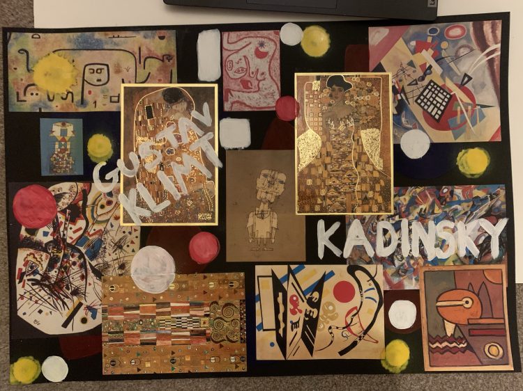
For my final route 4 I decided to use Gustav Klimt and Kandinsky as a source of inspiration, Kandinsky of course an original teacher at the Bauhaus school, In his work lots of shapes are featured, and for this last piece I wanted to draw a lot of inspiration from the idea of shape and how I could manufacture shape. Gustav Klimt who famously made “the kiss” piece and inspired Austrian expressionism, also has a lot of shape embedded within his work, often gold or brown with shapes within shapes, his work could also have inspired artists like Anni Albers who’s weaving patterns show a direct resemblance to the simpler pieces by Klimt. For this route I want to focus on what can be made through unconventional shape, since shapes are quite a solid obvious presence I want to create something quite solid and obviously shaped.

One of the first ideas I started with was to make some squares with Bauhaus shape like designs within them, the idea behind this was to create a series of squares that I could join into a slightly disjointed more unique garment. One idea is to perhaps sew the shapes onto panels or square shaped fabric, or even machine embroider them on, or to try something like clay work or 3D work to link with how I want to show shapes as solid. I wanted to ensure I had a mix of more simpler designs with more complicated ones that include multiple shapes and ideas. To start with I went with Black and white for an easy base design, however I’m not sure whether black is too harsh for the natural vibe that I want with this result.
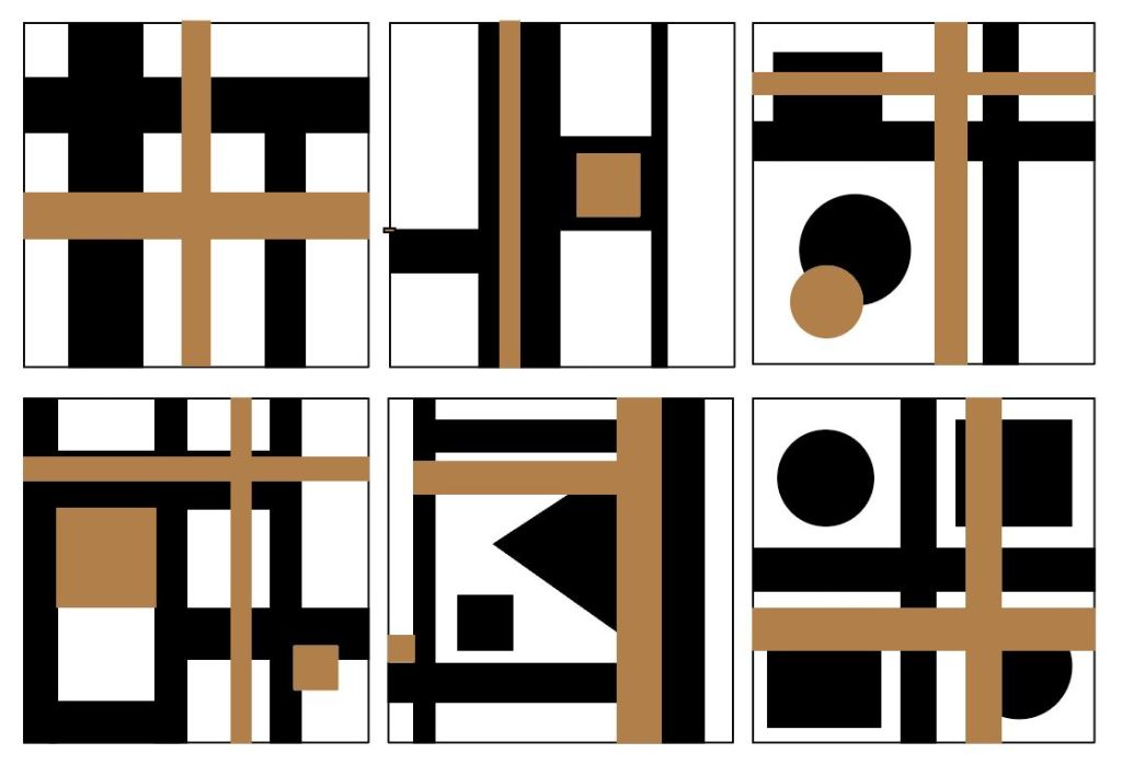
I next decided to intricate another colour to the designs to see how three colours work rather than just two, I originally thought this would be a really good idea however looking at the results I’m not too sure, the results seem quite busy and take away from the simplicity and designs shown in the work of Bauhaus. I do however really like the beige terracotta like colour, if I was to take away the black I think I would much prefer the outcomes, it would still have the bold outcomes of Bauhaus but also some direct influence from Gustav Klimt as the shapes in his work are a yellowy terracotta colour.

To run with the idea of a terracotta and white mix for the squares I decided to experiment with some easy airdry clay to see if I could produce the effects that I had envisioned. The two tiles on the right are dry, which slightly lightened the terracotta clay colour, and colour wise I really love the outcomes, the colours go well together and give off a sense of naturalness, this is the only result where I have deviated from my idea of secondary colours, however I am already loving the idea and the spin on Bauhaus. The only things I don’t particularly like is that they feel a little too busy, the circles didn’t work quite as well as I had hoped and they are a tad messy, but these are all fixable things with another attempt.

The next idea that came to me was the idea of multiple clay tiles like the ones I made previously that could interlock with each other to create a Bauhaus like shape and design, with a small hole in each corner so I could wire, string or sew them together, I settled on around 8-12 tiles, depending on size of course, however after doing these designs I think they will have to be more of an overlay onto a garment that I make since on their own it would be hard to make some thing from them. In my designs I used black grey and white for the tile colours to see how I felt about using three different colours on an actual design, I still have come to the conclusion that its a little bit too much, especially when they are all together.

My next step was to move onto the construction and design of these clay tiles, I went with the idea for a white and terracotta coloured clay for a natural appearance, It was quite hard to make the clay have a clean looking result, the two on the top left were the first ones I did when the clay was still a little too wet and hard to shape properly, however as it went on I got the hang of it more and more, one of my mistakes was perhaps the type of clay I bought, the white was a cheaper brand than the terracotta and was therefore wetter and a lot harder to use, wheras the terracotta was perfect. I tried to mix the squares so they were all different, some with white shapes on white background or some with both shades on one background. I love the finished results since they all seem different and the holes in the corners worked really well, I did 12 in total which may be quite a few too many for my final outcome however at least I have a lot of choice for which ones I can pick.
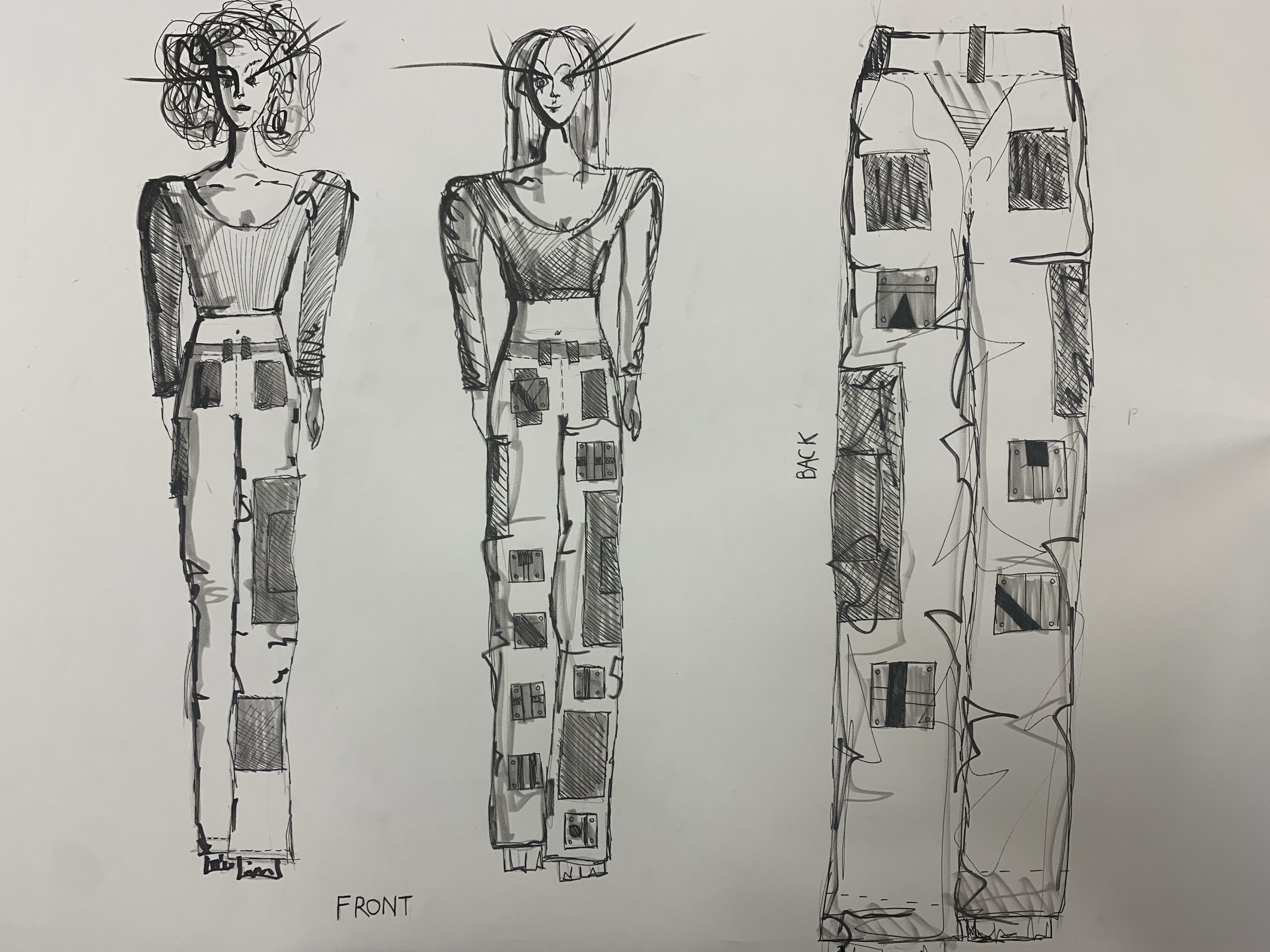
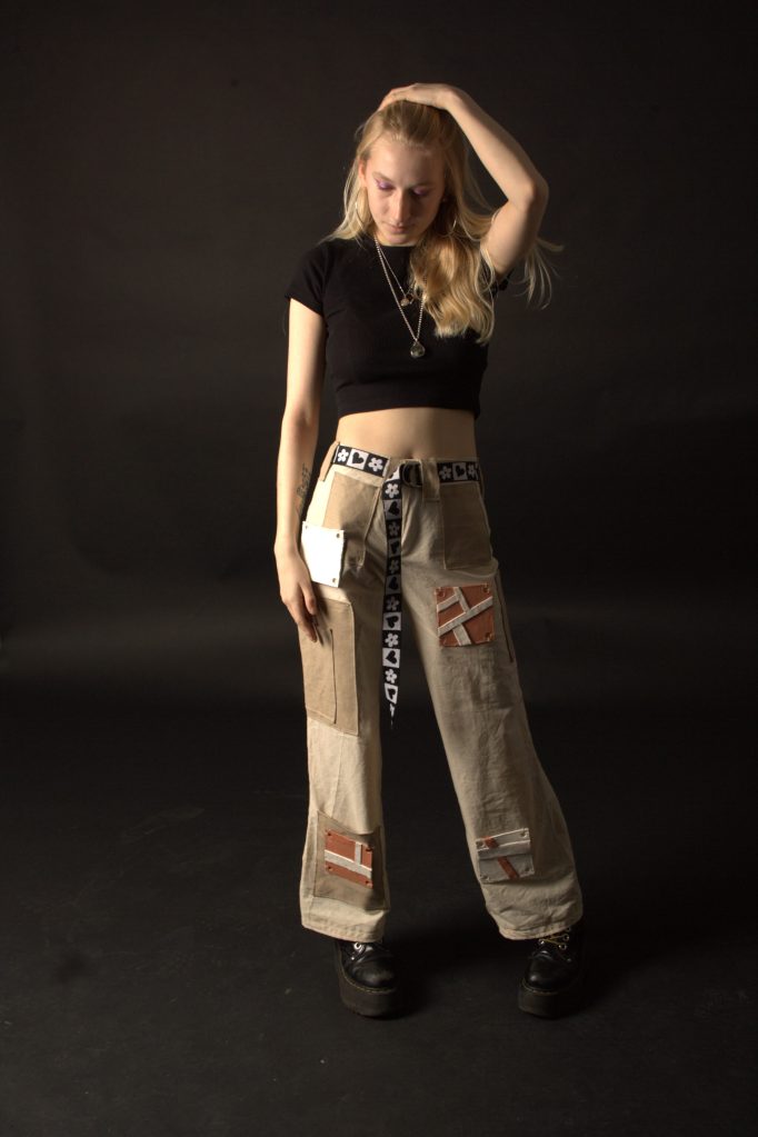
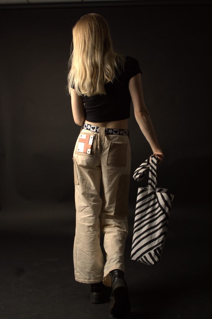
My next idea resolved around the actual outcome for this last path, I went through a few ideas regarding how to construct this outcome, originally I was going to wire the clay together in a clay square idea or tie them together with something resembling shoe laces however I then decided it would be better to construct a garment and use the clay shapes as a element to further that garment, I will ideally sew them onto the trousers. Above I sketched up my design, on the left is my basic design for the trousers, I wanted to make some that resemble cargo pants that are quite popular at the moment, as a way to modernise Bauhaus and create something younger people would want to wear. The plan is to use two colours, both canvas and terracotta like in colour and use big pockets to add the two colours. The second design is almost the same as the first, only with the addition of 7 clay squares onto the front, I don’t know if the trousers will be able to hold the weight, but I can always change this number according to trial and error when the trousers are made. The final larger sketch on the right is the back of the trousers to show a completed look of where the pockets will be and where the final 4 clay squares will go, if the weight can be held by the material.

For a quick mood board to bring some ideas together I found a few pairs of beige/ terracotta cargos to use for inspiration, particularly the two at the top right which feature square pocket designs like I will be trying to create.


Overall Analysis
During this project I have experimented and followed four different pathways relating to the segment of The Bauhaus movement that I chose, which was pattern and colour. To begin with I chose some key artists for my project such as Johannes Itten and his colour theory, Anni Albers and her weaving and Kandinsky’s surrealism. I found some primary influence work around the city, things like wallpaper samples, furniture advertisements, and jumper material which related really well to my first pathway where I focused on the work of Anni Albers and Paul smith, I created a mood board in my chosen secondary colour scheme of green, orange and green. I continued to create weaving samples and designs featuring the weaving idea, but I also continued a knitting idea which linked directly to Paul Smith. For my first final piece I decided to create a knitted dress with a black body and orange purple and green Bauhaus like squares that match the sleeves and edge of the dress. For my second route I wanted to focus on how I could use colour and pattern to create a printed result, I started again with a mood board of ideas and an example colour scheme. I then continued on to make a big A2 piece of printed work using tape, ink and printed pattern, I used this initial print to create different prints through digital colour manipulation. Through my design process I created 3 base designs and made digital dresses out of my print images to work out which design would be best. I did some paper manipulation on top of magazine cut outs and then decided to use paper designs for my final piece for this path, I created two results for this path, one with the green prints and one with the purple prints, my favourite of the two is most definitely the purple one, it seems brighter, and I like how it stemmed off my original design. My next idea was to use the original designs of Dicker and Singer to create a response, to research I visited the Wein Museum in Vienna where they had an exhibition on the original Bauhaus designs, I designed a few designs based on these and then moved towards a machine embroidery path. After experimenting with batting I deliberated using padding to make the piece thicker but I decided to go with a embroidered waistcoat with shapes and designs in orange on a purple background. I had a bit of trouble making this outcome, originally it was lined with orange however I accidentally messed up the arms and had to make it again without lining due to time! This outcome could be better; however, I am hoping my last response makes up for it. Lastly I used the ideas of Gustav Klimt and Kandinsky to run with the ideas of shape and more natural colours, I started by making some digital designs for some squares inspired by the artists and classic Bauhaus style, I deviated from the secondary colour scheme and kept all the colourings natural. After making the designs into clay I designed a garment to attach them onto, after deciding on trousers because it was something I had never done before I created them with canvas and beige material and attached the clay. Overall I think my outcomes properly responded to different types of colour and pattern influence within Bauhaus, I think my strongest work was the clay trousers result and the print work as they both explored something new for me.
