Mark making for illustrative drawing
During skills week I had the opportunity to experiment with many different medias and forms of art, my first workshop was called mark making for illustrative drawing, which taught me how important mark making is in the process of drawing and illustrating to create interesting and unique textures. I experimented with lots of different types of marks, swirls, lines, bubbles and saw how the different intensities of each mark can present a different emotion and change the form of an image. We also used marks to present different emotions and tried to present things like the feeling of anger into a mark, and then the opposite with the feeling of calm, as you can see strong feelings of fear and anger connotate with thicker darker lines, wheras calming feelings have softer, less intense lines. As one of the pathways I am wanting to pursue is illustration this was very helpful for learning different ways to create an effect within drawing, I definitely think that this will be helpful in my further work as I can use the techniques that I have learnt to create images that present emotion. This workshop also allowed me to reach out of my comfort zone since my preferred media to create artwork in is through pencil and fine liners, wheras in this workshop I had the opportunity to experiment with charcoal and its effects, while I dont think charcoal is something I want to use further in my work it has shown me that drawing with different medias can create new types of art.

Colour mono printing
The second workshop which I attended during skills week was colour mono printing, something which was also completely new to me since I have never experimented with mono printing, let alone colour mono printing. When I usually work in the form of printing I go for lino printing as I prefer the ability to create my own designs in a manner that isnt as abstract as the results mono printing produces, I did attempt to create a print with a design in it, through the boat print, however it was a lot less simple than with lino printing. This process did allow me to be very creative though since with mono printing there is the opportunity to use various colours, textures and layers to create the desired effects. As is shown in the first print I used tissue paper and bubble wrap to create a unique texture and make a print that resembles an octopus or a sea scene, I then created print two where I blocked off more white space and went back into my design with a darker colour, by my third print I practised some colour theory to create a lighter colour (I also learnt that while mixing colours you should never use black!) and experimented with string and other items, but I wasn’t a fan of the lightness and messiness of the result. Although my work and style isnt very abstract I have been thinking that within illustration I can bring in the colour theory I learnt in this workshop, and even the layering to create a better effect, by layering designs I could create more effective work which has sparked many ideas for me. I could also layer up fabrics perhaps with different thicknesses, for example layering lace and see through textures to create a new style of fabric for me to sew with.


Drawing with the machine
During skills week I learnt a technique called drawing with the machine where I used a embroidery foot on a sewing machine to sew designs into fabric, this was the first time I had used a foot like this so it was very interesting to me, and I will definitely be buying one. For the process we sketched our ideas onto a thick piece of non-stretch fabric and then put it into an embroidery hoop, with the flat side on the base of the sewing machine. At first I found sewing freehand with the embroidery foot quite difficult because I’m used the much slower pace of normal embroidery but I found that after a while I really found a liking to It, an important thing for me to realise was that machine embroidery doesn’t always produce the neatness that hand embroidery does (although with practise I’m sure it would) but just going with the flow and seeing where the needle took me allowed me to experiment with a flower and mushroom scene and a little monster – I really like how both of them came out! I even worked into a spare tote bag I had with a funny Halloween design and I cant wait to embroider some of my own clothes. The designs are messy but in a continuous line way and they seem very artistic and free as I didn’t have to worry about if the work was perfect. In the future I think I will use this method to embroider onto my sewing garments and perhaps make a project where I make beautiful clothes and embroider little monsters and creatures onto them as mixing the ugly and beautiful really inspires me. Like with the felting workshop the sustainability aspect is very interesting to me as being able to embroider my own clothes instead of buying something store bought is a lot better for the planet. I also learnt some new hand embroidery in the workshop such as how to embroider a rose and lots of different stitches which I can’t wait to try out.


Felting
During skills week one of my favourite new methods which I was taught was felting, this is something I had briefly done before but never in so much detail and I really enjoyed being able to use all the different colours to make patterns and a scene. During the workshop I made a purple and green piece of felt depicting a ghost and moon, I really loved the outcome, especially the vibrancy of the colours and the ability to make any fabric or design I want. I think in a future project I will definitely be using the method to perhaps create a top or dress sewn out of many felt designs as I feel it offers a way to add a more personal touch to your work. It also interests me because of the sustainable aspects which were discussed during the workshop, using felts and recycled fabrics through up cycling is a fantastic way to make the fashion industry greener which is particularly important to me. It was definitely a useful method and something I will definitely be taking further within my work and I’m excited to see how mixing felting and sewing would turn out, the process was also very easy, a lot easier than I expected, all I did was lay a base layer of felt on a base of bubble wrap and then lay lots of different colours in opposite directions so that the felts bond together properly, when I finished making my design I sprayed the design with soapy water and rolled it in the bubble wrap until everything was properly bonded together.

Drawing with Ink and Bleach
The next workshop which I did during skills week was called drawing with ink and bleach where I used blue, black and brown inks to create different types of strokes like I learnt in the mark making, however to take this a step further I worked into the ink with bleach to cause some dramatic colour changes, my favourite was the brown ink which turned a blue like colour that I particularly love. After doing some experimenting and meaningless marks just to see what I could create I went foraging for some leaves and flowers, to cover in bleach and then press into patches of ink, as is shown in the image below the print of the leaf into the far right ink created a great blue imprint and I feel is the most effective by far. I then moved onto using the ink and bleach to create a fantasy like creature, the colour changing really added the fantasy aspect and although I was initially sceptical about how well this would work with my style but I absolutely love the results! I didn’t think I would want to take this skill into my work but I think I will after these since I love the colours and textures and I think it compliments my creative style.


Weaving
Another fabric based workshop that I attended was the weaving workshop, I had never done this before however it was a lot easier than I had initially thought, it did take a long time though, the process involved a piece of thick card and cutting many indents into each side. I think wound yarn with no stretch around each indent to make big loops, then I worked into the yarn with many different types of fabrics, strings and wool, I tried to use lots of different textures and colours to see what I could create. I really like the result however there is definitely areas I could have improved on, for example the yarn I used for the initial winding had a bit too much give which meant towards the middle of the piece of weaving it became a lot smaller than the edges, meaning the result isn’t a perfect square. I also stuck to quite boring types of wools where instead I could have used strips of fabric or twine or anything I could find, maybe even a long piece of grass or leaves. I think I will definitely try to use some weaving within my further fashion and textiles projects, I could sew many different squares together to make an item of clothing, however the amount of time it takes could definitely be hindering, however if I made a really detailed woven piece I could put it on a top or as a patch on a jacket. This again was a really sustainable and good way to reuse materials and create something great, I could even use natural materials to make the entire woven patch from leaves of branch shavings.

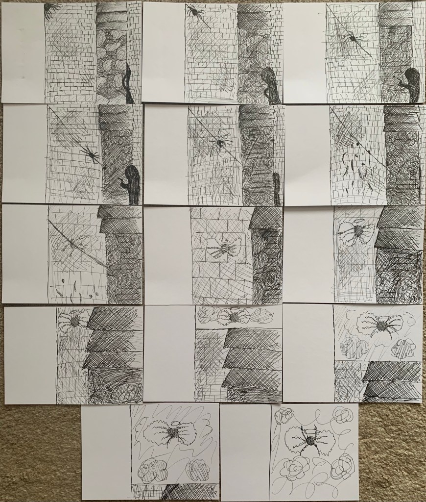
Making a flip book through hand drawn animation
One of the more illustration based workshops I took part in was making a flip book through hand drawn animation, animation is made through many forms, mainly digitally nowadays, although there has been animated movies like nightmare before Christmas that makes figures and moves them to create a moving picture. The flip book I made required a series of images with a similar background and small movements to create a consistent narrative, I chose to draw a wall with a spider creeping from the left and a mysterious figure sneaking around the right, the book tells the story of a spider being shot and flying up into the sky as a ghost with wings. I really enjoyed creating this flip book and it taught me a lot about how small the changes in each panel need to be for the narrative to flow better, the lack of flow was the only issue in my book as I feel like when you physically flip it the narrative gets lost in all the detail of the background. If I were to create another one I would stick to a simpler design, maybe just one main thing in the middle bouncing or going on a walk so that the changes from scene to scene flow like digital animation.
Experimental Drawing
The only fine art based workshop I took part in was experimental drawing which taught me a lot about how I approach drawing a object and how to be more careful with my observation techniques when drawing from a object in real life. To begin I let loose with a pencil and a giant piece of paper and drew in lines and squiggles wherever the pencil took me to experience the quality of lines a pencil could make along with the weight and speed. I then chose a pinecone and began a series of drawings which all worked towards us using a pencil and our eyes in a more efficient way. The first exercise was continuous line which made me aim to make no mistakes as rubbing out and redoing was not an option, I think it made my work more precise as I was more wary of my need to make my lines correct the first time. The second exercise was drawing with my left hand which I really enjoyed because while I still had some control I didn’t have quite as much, this meant that while I feel my pinecone was still accurate it had some freedom that I don’t have in my drawings with my right hand, this somehow created a more nature-y natural look which I enjoy. My favourite turnout of all the experiments was when we drew the pinecone by only looking at the pinecone, we couldn’t look at the drawing we were creating at all! This allowed me to really tune into the tiny details of the pinecone, and while they didn’t translate onto the page very well because I had no idea what I was drawing I found that I was noticing new things that I hadn’t seen before. I actually love the result as well, it may not look like the pinecone I was drawing but it is very effective regardless. The other experiments were drawing using touch and how the pinecone feels as an influence which shows how different senses can be an influence, standing up and barely holding the pencil to create a scribbly more free drawing and drawing from memory to see how indented this pinecone now was in our brains. Overall this workshop was definitely the one that taught me the most about how I conduct myself around drawing and how to let loose if something isn’t going perfectly and how to draw in different ways to produce very different results.


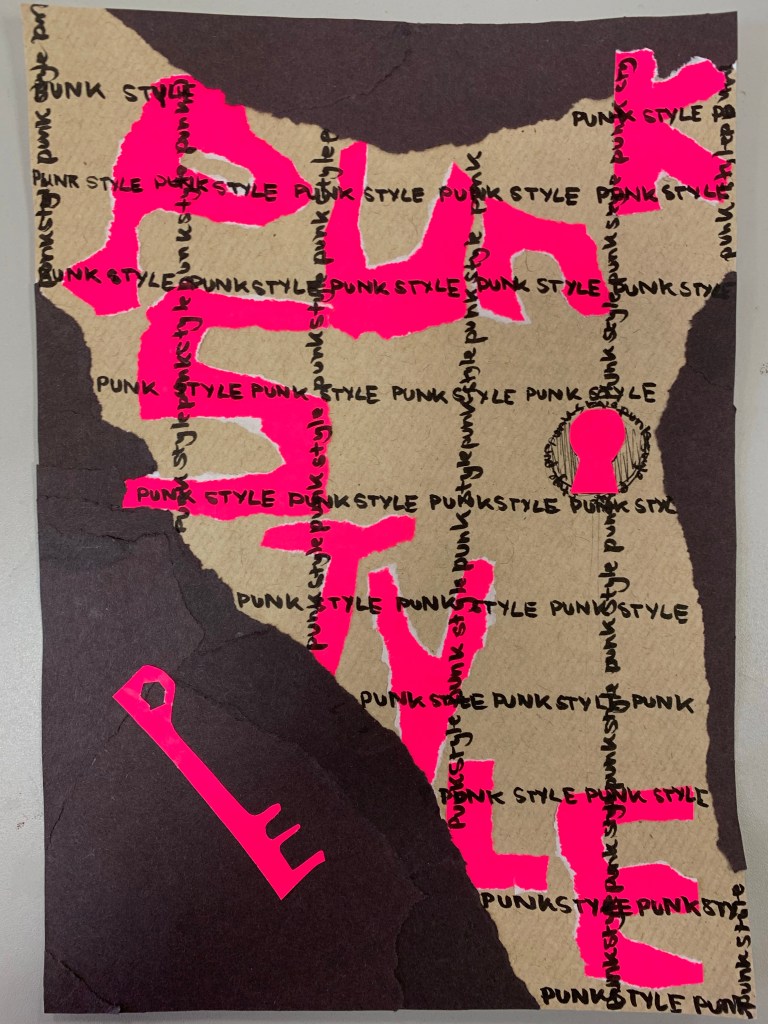
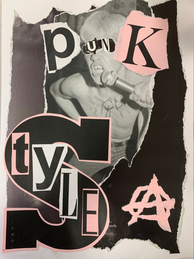
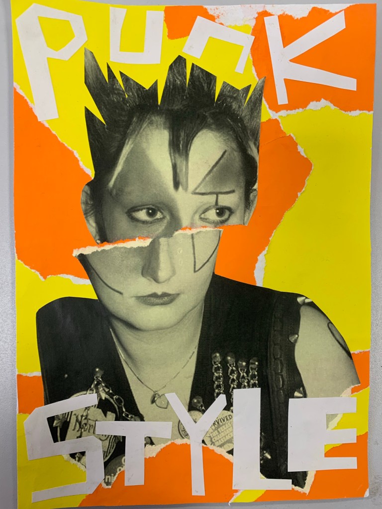
Punk Graphics
The last workshop I attended, and also the first Graphics workshop I attended was the one on Punk Graphics, this was most definitely the workshop I had the most fun in, it was a great experience to just be able to tune into colour, text and image and create. I learnt a lot about how text should be positioned against colour and images to stand out, and how to ensure images dont get lost within a collage and become too overwhelming. We had to create one poster on that made up the punk style only using text, I actually really don’t like this poster because the poster itself doesn’t seem too punky and the effect of being locked up didn’t really work for me. We then had to make a poster which was simplistic and used just one photo, for this one I created a light pink and black poster with big text and a big image to try and make it stand out, however with this one I think my downfall was the light colours as it still didn’t STAND OUT, however for my next one I think I captured the punk style with a bright yellow, orange and white background and one simple image, it has the stand out effect that had been lacking before and I love the result. I also created a final poster which had more details, I originally had 2 photos on it however it looked like a bit of a bland mess so I removed the light pink and second photo and added the bright pink for some better contrast. Overall I loved the freedom I had with this workshop and how it allowed me to learn more about the punk movement and try to create something in its style, and I feel like the more posters I made the more I was able to understand the punk style.